Visual harmony in design isn’t just a catchphrase – it’s the underpinning of great graphic work. Striking the right balance in designs ensures that each element, while distinct, complements the others.
Even though tools like the AI generator can provide innovative designs, the essence of visual balance stems from the human touch and an understanding of design principles.
Contents
1. The Weight of Elements: Understanding Importance
When elements in a design have unequal visual weight, the design feels off-kilter. Think of a seesaw; if one side is overloaded, it doesn’t function as intended. Similarly, in graphic designs, each element’s placement, color, and size should be balanced to ensure visual stability.
This doesn’t necessarily mean symmetry but rather a sense of equilibrium where the viewer’s eyes can comfortably travel across the design. The reasonable arrangement of elements allows the viewer to navigate the design effortlessly, appreciating each element’s contribution while experiencing a cohesive whole.
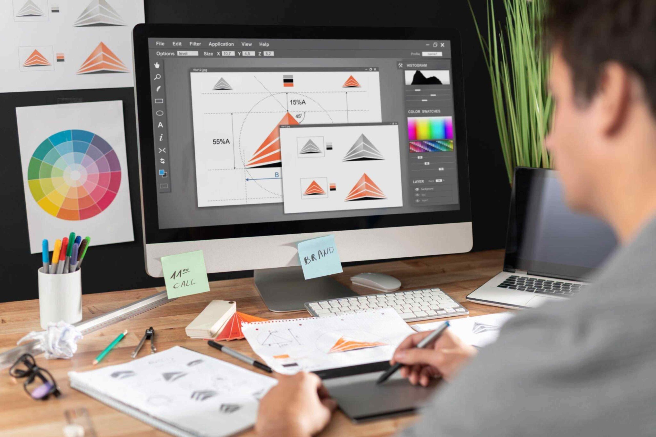
2. Color Coordination: Crafting Cohesive Palettes
Colors can make or break a design. Imagine a serene beach scene suddenly disrupted by a splash of neon – jarring, right? The color choices in graphic designs should be harmonious and evoke the desired mood or emotion. Colors have their weights and can either draw attention or recede into the background.
Choosing a cohesive color palette ensures that the design elements play well together, creating a visually harmonious piece. Skillful color coordination transforms individual elements into an interconnected visual story, captivating the audience and leaving a lasting impression.
3. Space Exploration: Using Negative Space Effectively
Space isn’t just the final frontier; it’s an essential component for balance in graphic design. The areas without any design elements, known as negative space, offer breathing room. Like the silent pauses in a musical piece, negative space in design allows the primary elements to shine, facilitating a harmonious visual flow. The elegant interplay between filled and empty spaces guides the viewer’s gaze, enabling them to appreciate the design’s message and aesthetics with clarity and ease.
4. Texture Tunes: Adding Depth And Dimension
Texture in graphic design isn’t just about tactile surfaces. Visually, textures can add depth and dimension to flat designs. Consider the gentle ripples on a pond, adding movement and life to the water. Similarly, subtle textural variations can introduce layers, creating a rich visual tapestry that is engaging and balanced. When strategically applied, texture adds a tactile quality to visuals, enticing viewers to explore the design’s intricacies and fostering a sense of connection.
5. Alignment And Proximity: Order In The Design Chaos

Where each design element is placed matters, alignment creates order, logically guiding the viewer’s eyes. On the other hand, the proximity of elements to each other can create relationships. Elements close to each other are perceived as related, whereas those spaced farther apart seem distinct. One can achieve a layout that radiates visual harmony by strategically aligning and placing design components.
The marriage of alignment and proximity orchestrates a visual choreography that guides the viewer’s attention and imparts a sense of purposeful arrangement. Adobe states, “As a type of generative AI technology, AI art generators work similarly to other types of artificial intelligence, which use a machine learning model and large datasets to be able to produce a specific type of result.”
Conclusion
Creating visual harmony in graphic designs is akin to orchestrating a beautiful symphony. Each note, while unique, contributes to a larger, harmonious melody.
By understanding and applying core design principles, any graphic artist can craft designs that resonate with balance, beauty, and brilliance. After all, in the grand theatre of design, harmony is the star that shines the brightest.